 FAQs
FAQs
Allows you to add tab list block on your page.
Tip: Quickly duplicate or delete items by clicking an item’s Duplicate or Delete icon
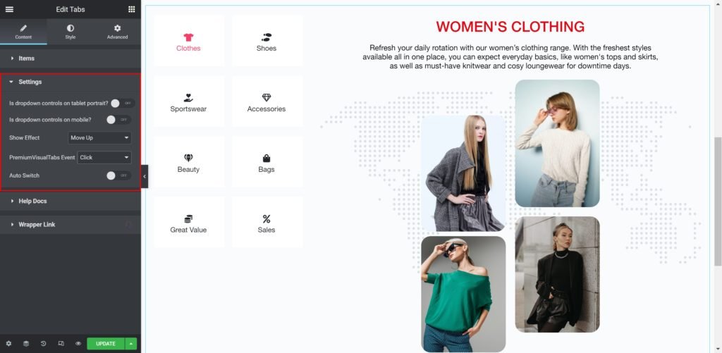
Content
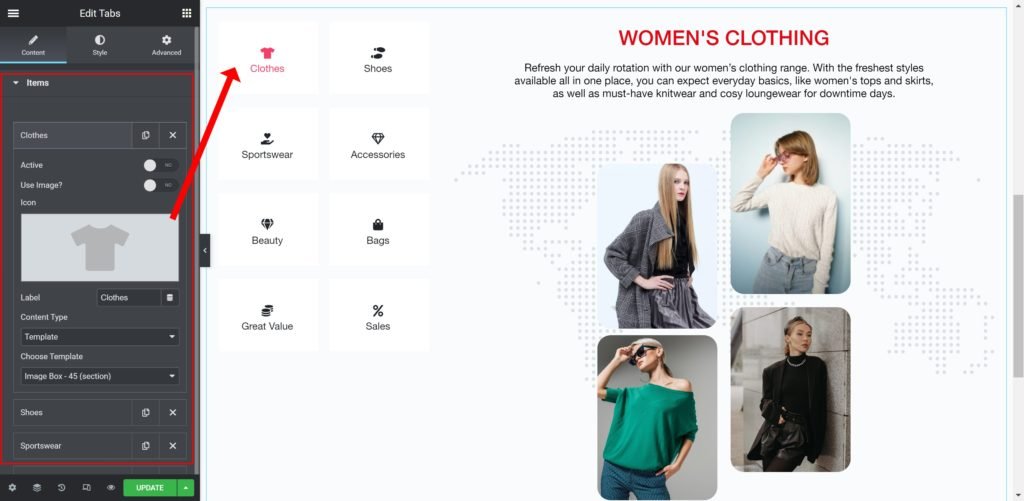
By clicking on each item you can customize their content and settings, which are:
- Active: Choose whether to make the icon active or not.
- Use Image: Choose an image from the media library instead of icon.
- Icon: Choose from a list of Font Awesome icons.
- Label: Enter the title of the icon box.
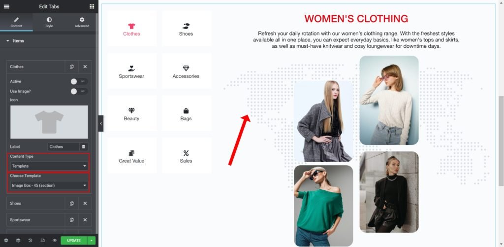
- Content Type: Enter the description of the feature.
- Choose Template: Enter the description of the feature.
Content Settings
Style Setting
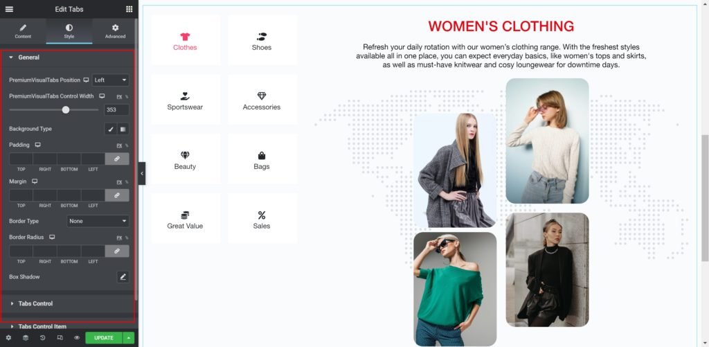
You can manually edit styles for each item
Tabs Position: Set the position of the tab as right, left and center.
Tabs Control Width: Set the width of the tabs manually.
Background
- Color: Set the background color for the tabs.
- Image: Choose an image from the media library.
- Text Padding: Set the distance between the icon and the border.
- Border Radius: Set the border radius for the tabs background to control corner roundness.
- Box-shadow: Give the tabs a box shadow.
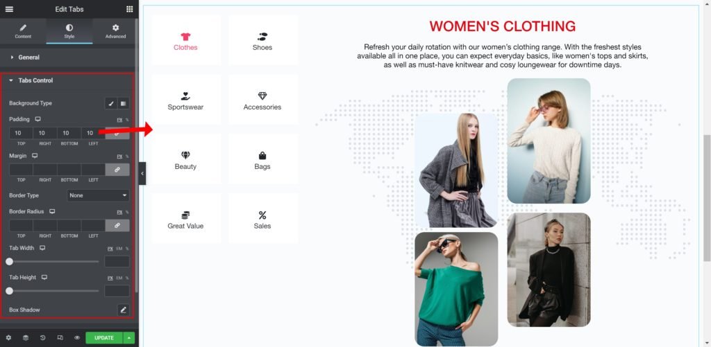
Tabs Control
- Background Color: Set the background color for the tabs.
- Background Image: Choose an image from the media library.
- Tabs Box Padding: Set the distance between the tabs.
- Border Radius: Set the border radius for the tabs background to control corner roundness.
- Tab Width: Set the width of the tabs manually.
- Tab Height: Set the height of the tabs manually.
- Box-shadow: Give the tabs a box shadow.
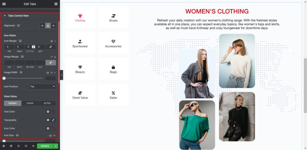
Tabs Control Items
- Alignment: Set the background color for the tabs.
- Icon Margin: Set the outer spacing between the edge of the icon and the edge of the item.
- Image Margin: Set the outer spacing between the edge of the image and the edge of the item.
- Image Width: Set the width of the image manually.
- Icon Position: Set the position of the tab as top, middle and down.
- State Styles: You can manually edit styles for (Normal – Hover – Active).
- Text Color: Set the tab’s text color.
- Typography: Customize the typography of the text.
- Icon Color: Choose a color for the icon.
- Icon Size: Choose a size for the icon.
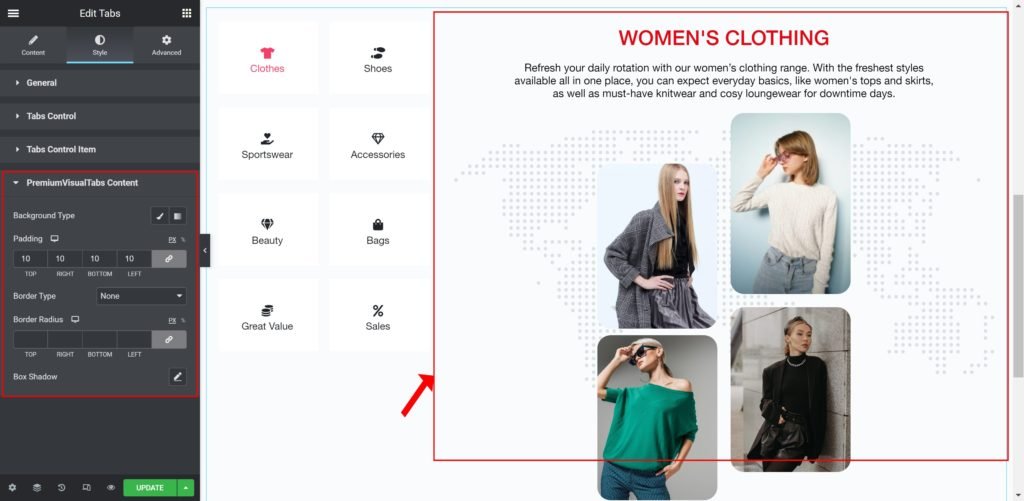
Tabs Content
- Background Type: Choose whether to display the background as color or image.
- Padding: Set the inner spacing between the edge of the background and the edges.
- Image Margin: Set the outer spacing between the edge of the image and the edge of the item.
- Border Type: Choose the type of the border.
- Border Radius: Set the border radius for the tabs content to control corner roundness.
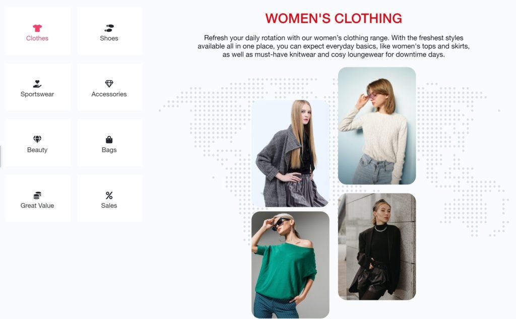
Output