 FAQs
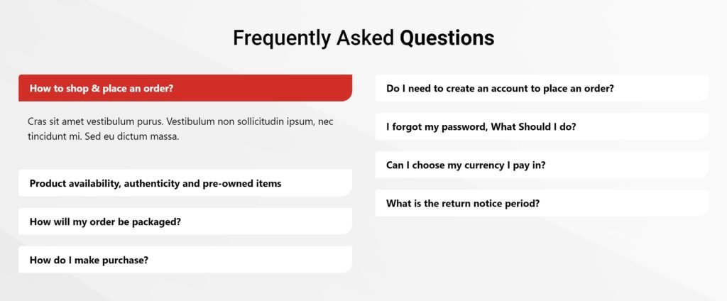
FAQsAllows you to add FAQS block on your page.
Content Settings
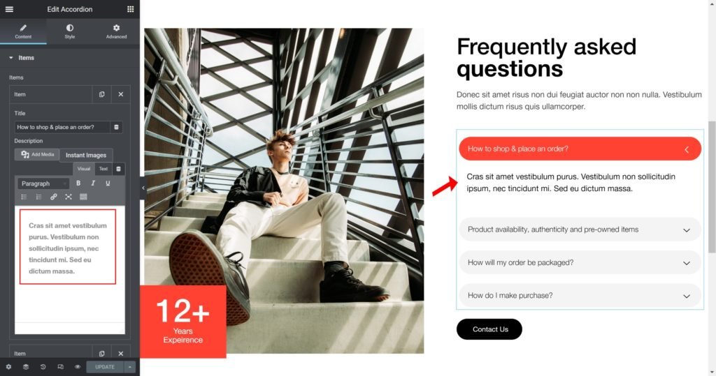
A list of all the features you are offering. You can drag and drop items to change their order. Click on the Add Item button to add another item to the list.
Tip: Quickly duplicate or delete items by clicking an item’s Duplicate or Delete icon

By clicking on each item you can customize their content and settings, which are:
- Text: Enter the description of the feature.
- Icon: Choose from a list of Font Awesome icons.
- Icon Color: Choose a color for the icon.
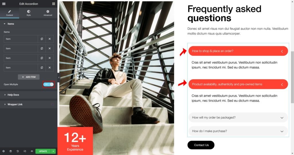
Open Multiple
Choose whether to open multiple or not.
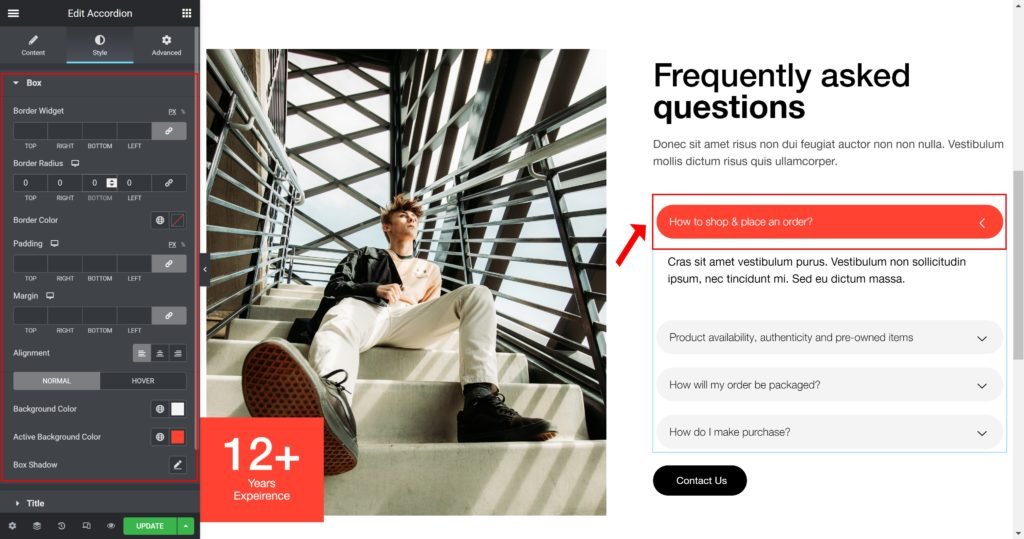
Style
You can manually edit styles for each element
Box:
- Border Widget: Set the thickness of the border around each slide.
- Border Radius: Set the border radius for the images to control corner roundness.
- Padding: Set the inner spacing between the edge of the content and the edge of the slide.
- Margin: Set the outer spacing between the edge of the content and the edge of the slide.
- Item Height: Set the height of the widget.
- Alignment: Align the content to the right, left or center.
- Background Color: Set the background color of the overlay when you hover over the image.
- Border color: Choose the border color.
- Box-shadow: Give the search bar a box shadow.
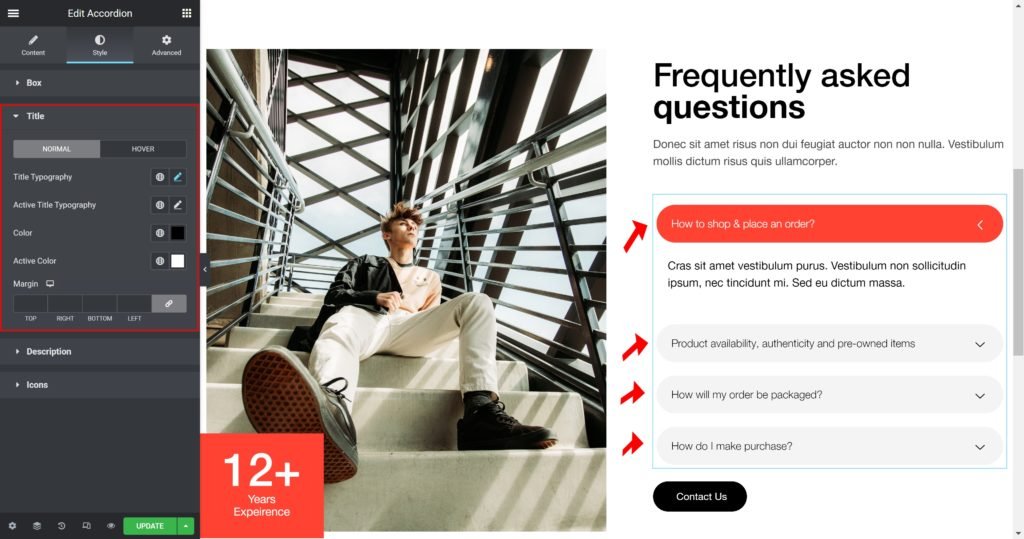
Title:
Title Typography: Customize the typography of the Title.
Active Title Typography: Customize the typography of the Active Title.
Color: Set the post’s Title color.
Active Color: Set the post’s Active Title color.
Margin: Set the outer spacing between the edge of the Title and the edge of the item slide.
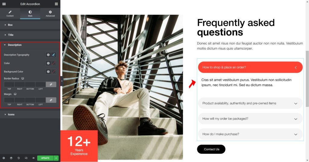
Description
Description Typography: Customize the typography of the Title.
Color: Set the post’s Caption color.
Margin: Set the outer spacing between the edge of the caption and the edge of the item slide.
Padding: Set the inner spacing between the edge of the caption and the edge of the item slide.
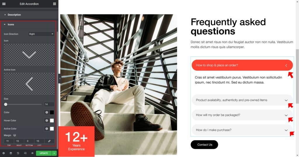
Icons
Icon Direction: Choose a direction for the icon as left or right.
Icon: Choose from a list of icons.
Icon Color: Choose a color for the icon.
Hover Color: Choose a color when hover the icon.
Active Color: Choose a color for the icon is active.
Icon Size: Choose a size for the icon.
Margin: Set the outer spacing between the edge of the icon and the edge of the item.
Padding: Set the inner spacing between the edge of the icon and the edge of the item.
Output