 FAQs
FAQsLayout
Shows a list of all the items in the slide. You can drag and drop them to change their order. Click on the Add Item button to add another item to the list.
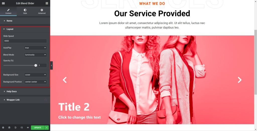
Slider Options
- Slide Speed: Set the time between slide movement, in milliseconds.
- AutoPlay: Slide to YES to have the carousel slide automatically.
- Arrows: Choose whether to show or hide the arrows
- Blend Mode: An element’s content should blend with the content of the element’s parent and the element’s background.
- Opacity (%): Set the overlay effect transparency.
- Background Size: Choose whether to display the background as cover or auto. The auto image is for situations where you have the exact sizes needed, and also where you would want the entire image to appear in the slider. The cover size is for more abstract and atmospheric images, where the showing of the entire image is less important.
- Background Position: Set the background position.
List Items
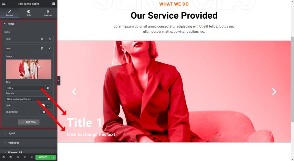
Shows a list of all the items in the slide. You can drag and drop them to change their order. Click on the Add Item button to add another item to the list.
- Image: Upload or Choose an image from the media library.
- Title: Enter the slide’s title.
- Subtitle: Insert the subtitle for the slide.
- Show Link: Choose whether to show or hide the link.
- Button Text: Set the text for the button.
- Link to: Add a URL the slide or button will link to.
- Slider Color: Set the slider’s background color.
Style
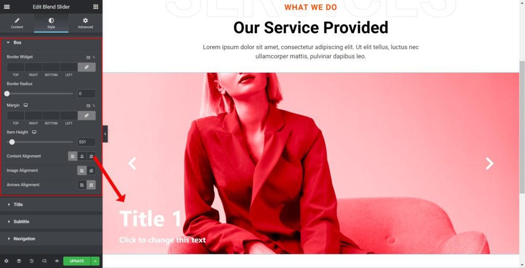
Box:
- Border Widget: Set the thickness of the border around each slide.
- Border Radius: Set the border radius for the images to control corner roundness.
- Margin: Set the outer spacing between the edge of the content and the edge of the slide.
- Item Height: Set the height of the widget.
- Content Alignment: Align the content to the right, left or center.
- Image Alignment: Align the image to the right, left or center.
- Arrows Alignment: Align the arrows to the right, left or center.
Title:
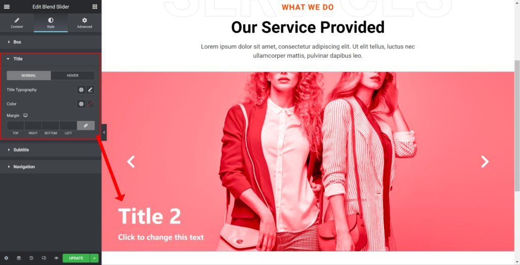
- Typography: Customize the typography of the Title.
- Color: Set the post’s Title color. The title appears within the overlay when you hover over the image.
- Margin: Set the outer spacing between the edge of the Title and the edge of the item slide.
Subtitle:

- Subtitle Typography: Customize the typography of the Subtitle.
- Color: Set the post’s Subtitle color.
- Margin: Set the outer spacing between the edge of the Subtitle and the edge of the item slide.
Navigation:

- Color: Set the color for the controls.
- Padding: Set the inner spacing between the edge of the button and the edge of the slider.