 FAQs
FAQsLayout
Allows you to add before and after banner into your page.
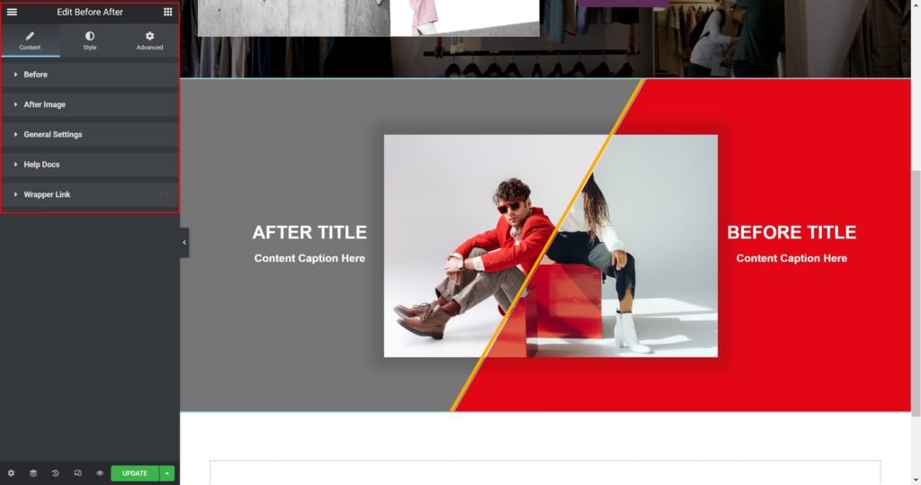
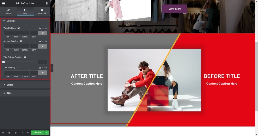
Content

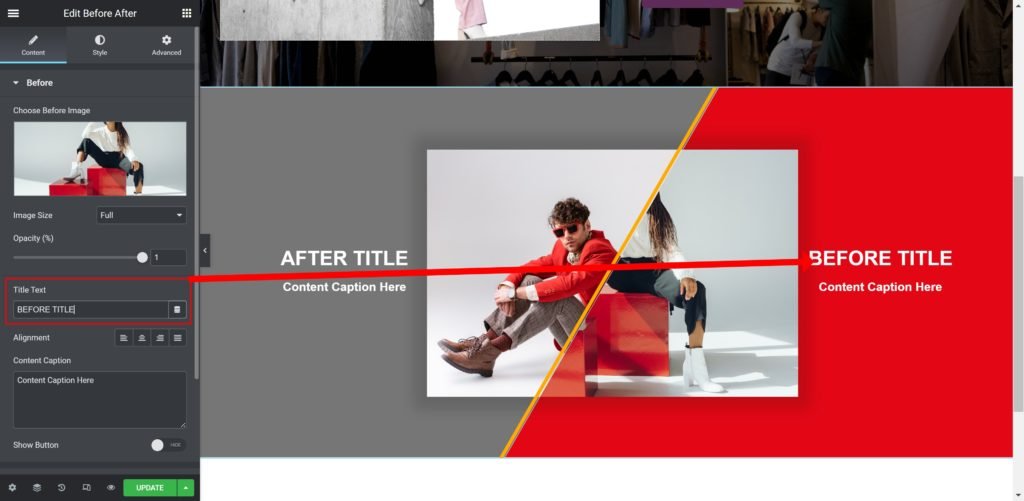
Before:
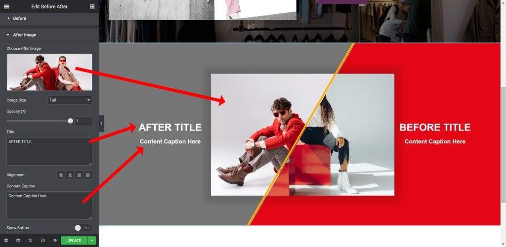
- Before Image: Choose an image from the media library.
- Image Size: Set the size of the image, from thumbnail to full, or enter a custom size
- Label HTML Tag: Wrap the label with a tag, either H1…H6, span, div or paragraph.
- Link to: Add a URL of the button.
- Add icon? Choose whether to show or hide the icon.
- Icon: Choose from a list of Font Awesome icons.
- Alignment: Align the content to the right, left or center.
Style
Box:
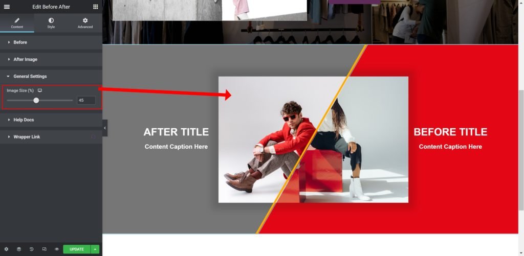
- Container Width: Set the width of the outer container.
- Fixed Size: Set the width and height of the button.
- Padding: Set the inner spacing between the edge of the content and the edge of the slide.
- Background Color: Set the background color of the overlay when you hover over the image.
- Border color: Choose the border color.
- Border Type: Select the border type, from none, solid, double, dotted, dashed, or grooved.
- Border Radius: Set the border radius for the images to control corner roundness.
- Border Width: Control the thickness of the border.
- Box-shadow: Give the search bar a box shadow.
Label:
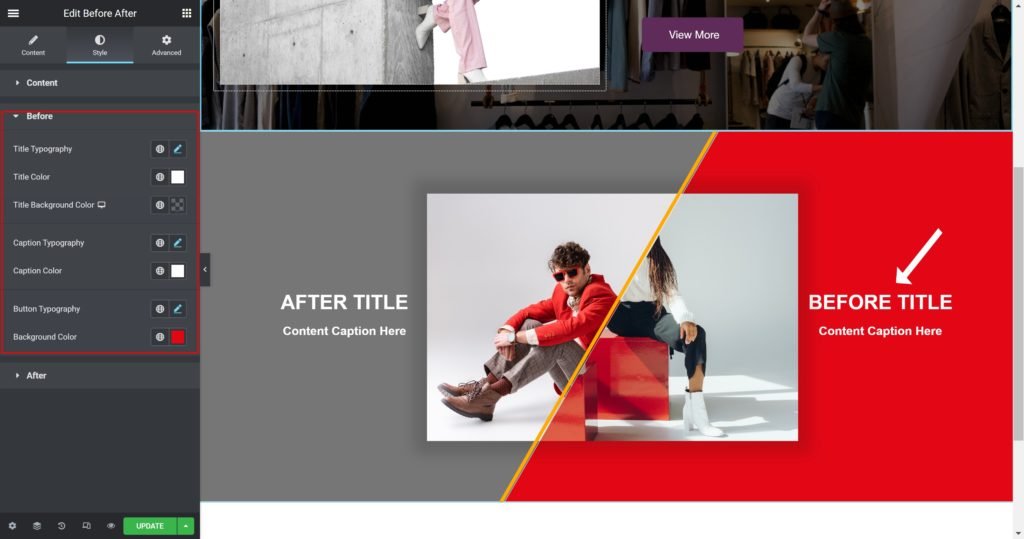
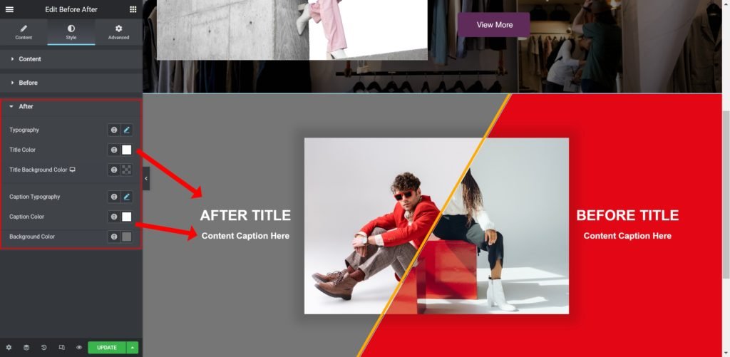
- Title Typography: Customize the typography of the Title.
- Color: Set the post’s Title color. The title appears within the overlay when you hover over the image.
- Margin: Set the outer spacing between the edge of the Title and the edge of the item slide.
Navigation:
- Color: Set the color for the controls.
- Margin: Set the outer spacing between the edge of the button and the edge of the slider.
- Padding: Set the inner spacing between the edge of the button and the edge of the slider.
- Font Size: Customize the size of the button text.
- Add space after icon: Set the inner spacing between the text of the button and the edge of the icon.
- Move icon Vertically: Set the vertical position of the icon.
- Style: Choose your button style from the list.
- Label Text: Enter the button custom text
- Label HTML Tag: Wrap the label with a tag, either H1…H6, span, div or paragraph.
- Link to: Add a URL of the button.
- Add icon? Choose whether to show or hide the icon.
- Icon: Choose from a list of Font Awesome icons.
- Alignment: Align the content to the right, left or center.
Style
Box:
- Container Width: Set the width of the outer container.
- Fixed Size: Set the width and height of the button.
- Padding: Set the inner spacing between the edge of the content and the edge of the slide.
- Background Color: Set the background color of the overlay when you hover over the image.
- Border color: Choose the border color.
- Border Type: Select the border type, from none, solid, double, dotted, dashed, or grooved.
- Border Radius: Set the border radius for the images to control corner roundness.
- Border Width: Control the thickness of the border.
- Box-shadow: Give the search bar a box shadow.
Label:
- Title Typography: Customize the typography of the Title.
- Color: Set the post’s Title color. The title appears within the overlay when you hover over the image.
- Margin: Set the outer spacing between the edge of the Title and the edge of the item slide.
Navigation:
- Color: Set the color for the controls.
- Margin: Set the outer spacing between the edge of the button and the edge of the slider.
- Padding: Set the inner spacing between the edge of the button and the edge of the slider.
- Font Size: Customize the size of the button text.
- Add space after icon: Set the inner spacing between the text of the button and the edge of the icon.
- Move icon Vertically: Set the vertical position of the icon.