 FAQs
FAQs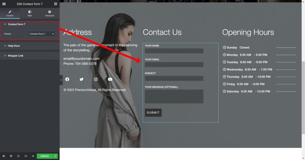
Forms: Choose contact form 7 from the list.
Label:
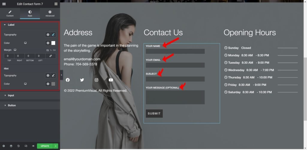
Typography: Customize the typography of the labels.
Color: Set the color of the labels.
Margin: Set the outer spacing between the edge of the labels and the edge of the item container.
Hint:
Typography: Customize the typography of the Hint labels.
Color: Set the hint labels color.
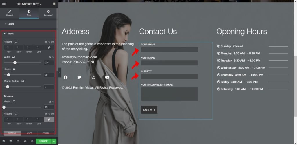
Input:
Padding: Set the inner spacing between the edge of the inputs and the edge of the container.
Width: Set the exact width of the input in either PX, VH, or EM.
Height: Set the exact height of the input in either PX, VH, or EM.
Margin Bottom: Set the outer spacing between the edge of the input and the edge of the item container.
Height: Set the exact height of the text area in either PX, VH, or EM.
Padding: Set the inner spacing between the edge of the text area and the edge of the container.
Background Type:
- Color: Set the background color for the text area.
- Image: Choose an image from the media library.
If an image is chosen as a text area background, additional options appear:
Size: Choose whether to display the background as a cover or auto. The auto image is for situations where you have the exact dimensions needed and would want the entire image to appear in the text area. The cover size is for more abstract and atmospheric images, where the showing of the whole image is less important.
- Border Radius: Set the border radius for the text area to control corner roundness.
- Padding: Set the inner spacing between the edge of the text area and the edge of the container.
- Box Shadow: Give the text area a box shadow.
- Typography: Customize the typography of the text area.
- Color: Set the text area color.
- Font Size: Set the text area font size.
- Placeholder Color: Set the placeholder color.
Button:

Alignment: Align the button content to the right, left, or center.
Typography: Set the typography options for the button text.
Border Radius: Set the border radius of the button to control corner roundness.
Padding: Set the padding of the button.
Margin: Set the outer spacing between the edge of the button and the edge of the item container.
Use Height Width: Choose whether to control the Width, Height, and Line Height of the button.
Background Type:
- Color: Set the background color for the button.
- Image: Choose an image from the media library.
If an image is chosen as a text area background, additional options appear:
Size: Choose whether to display the background as a cover or auto. The auto image is for situations where you have the exact dimensions needed and would want the entire image to appear in the button. The cover size is for more abstract and atmospheric images, where the showing of the whole image is less important.
Box Shadow: Add a box shadow effect to the button.
Border Type: Select the border type, from none, solid, double, dotted, dashed, or grooved.
Text Shadow: Add a box shadow effect to the button.