 FAQs
FAQsSlider Layout:
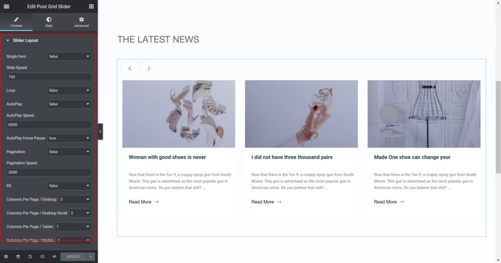
Slider Options
- Single Item: Show only one item per page.
- Slide Speed: Set the time between slide movement, in milliseconds.
- Loop: Have the slides rotate in an infinite loop and without stopping.
- AutoPlay: Slide to YES to have the carousel slide automatically.
- AutoPlay Speed: Set the speed at which the carousel will slide, in milliseconds.
- AutoPlay Hover Pause: Make the slide pause when the mouse hovers over it.
- Pagination: Select the carousel pagination style, either None, Dots, Fraction, or Progress.
- Pagination Speed: Set the time between slide movement, in milliseconds.
- Rtl: Choose a direction for the slider as left or right.
- Columns Per Page / Desktop: Select the number of slides to show at one time, from 1 to 6.
- Columns Per Page / Desktop Small: Select the number of slides to show at one time, from 1 to 6.
- Columns Per Page / Tablet: Select the number of slides to show at one time, from 1 to 6.
- Columns Per Page / Mobile: Select the number of slides to show at one time, from 1 to 6.
- Slide Navigation: Choose to display arrows, dots, both or none.
- Prev Button Text: Enter the Prev button custom text.
- Next Button Text: Enter the Next button custom text.
- Go To First: Select how many slides to scroll per swipe.
- Go To First Speed: Set the time here.
Layout
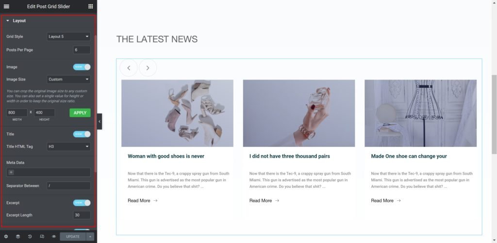
Slider Options
- Grid Style: Choose from different styles.
- Posts Per Page: Set the exact amount of posts to be displayed in the widget.
- Meta Data:
Source: Select the source from which the widget will display the content. Options include Date, Categories & Author. - Separator Between: Enter the custom meta separator.
- Excerpt: Enable or disable the excerpt text.
- Excerpt length: set the excerpt max text length.
- Read more: Enable or disable the read more button.
- Read more text: Enter the custom read more text.
- Alignment: Align the content to the right, left or center.
Query
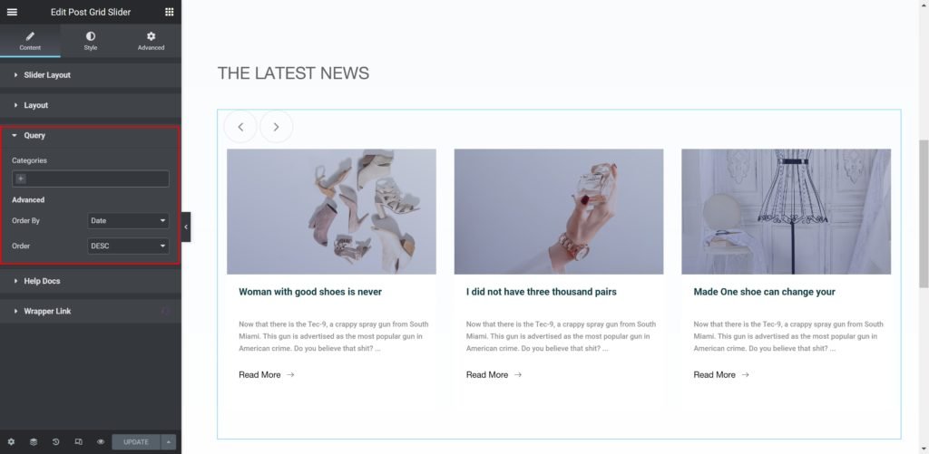
Source: Select the source from which the widget will display the content. Options include posts categories if available, manual selection, current query, and related. Depending upon which source you’ve chosen for the query, you’ll be given options which allow you to filter the results.
- Order By: Set the order in which the posts will be displayed. Options include: Date, Title, Menu Order, or Random
- Order: DESC (descending) or ASC (ascending)
Style


Box:
- Border Radius: Set the border radius for the images to control corner roundness.
- Padding: Set the inner spacing between the edge of the content and the edge of the slide.
- Background Color: Set the background color of the overlay when you hover over the image.
- Border Widget: Set the thickness of the border around each slide.
- Border color: Choose the border color.
- Box-shadow: Give the search bar a box shadow.

Image:
- Border Radius: Set the border radius for the images to control corner roundness.
- Border Widget: Set the thickness of the border around each slide.
- Border color: Choose the border color.
- Margin: Set the outer spacing between the edge of the Title and the edge of the item slide.
- Padding: Set the inner spacing between the edge of the content and the edge of the slide.
- Background Color: Set the background color of the overlay when you hover over the image.

Title:
- Typography: Customize the typography of the Title.
- Color: Set the post’s Title color. The title appears within the overlay when you hover over the image.
- Margin: Set the outer spacing between the edge of the Title and the edge of the item slide.
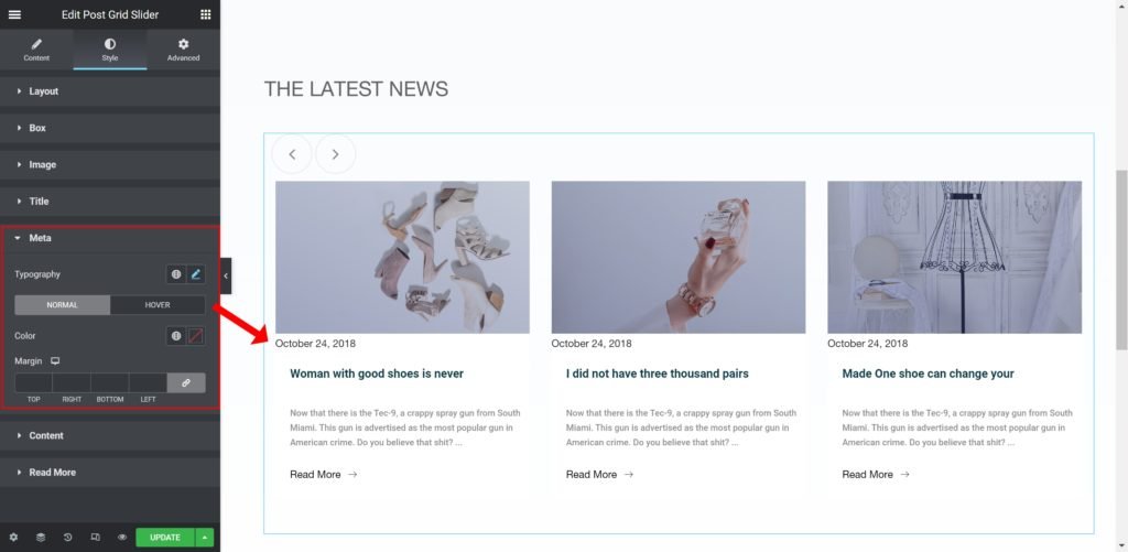
Meta:
- Caption Typography: Customize the typography of the meta.
- Color: Set the post’s meta color.
- Margin: Set the outer spacing between the edge of the meta and the edge of the item slide.

Content:
- Caption Typography: Customize the typography of the caption.
- Color: Set the post’s Caption color.
- Margin: Set the outer spacing between the edge of the caption and the edge of the item slide.
Read More:
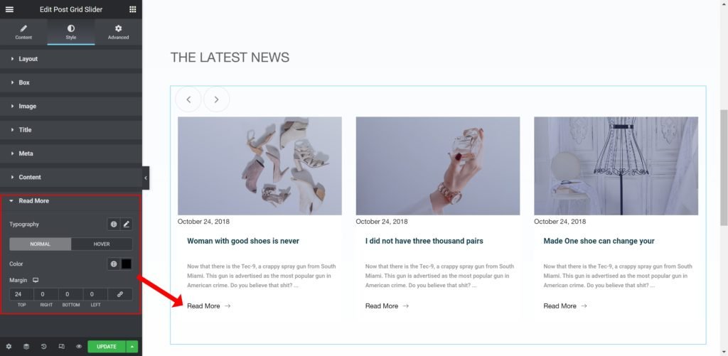
- Caption Typography: Customize the typography of the button.
- Color: Set the post’s Caption color.
- Margin: Set the outer spacing between the edge of the button and the edge of the item slide.