 FAQs
FAQs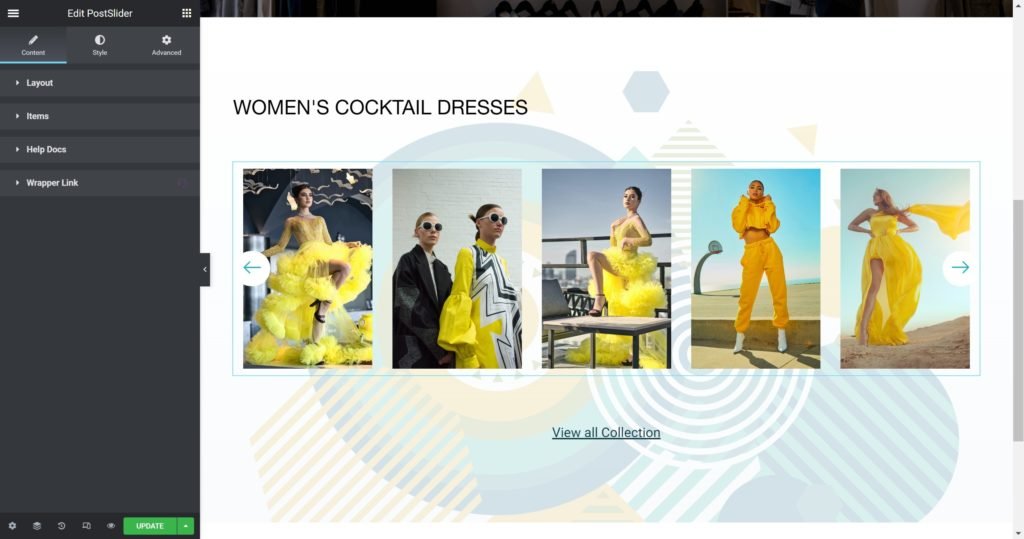
Layout
Shows a list of all the items in the slide. You can drag and drop them to change their order. Click on the Add Item button to add another item to the list.
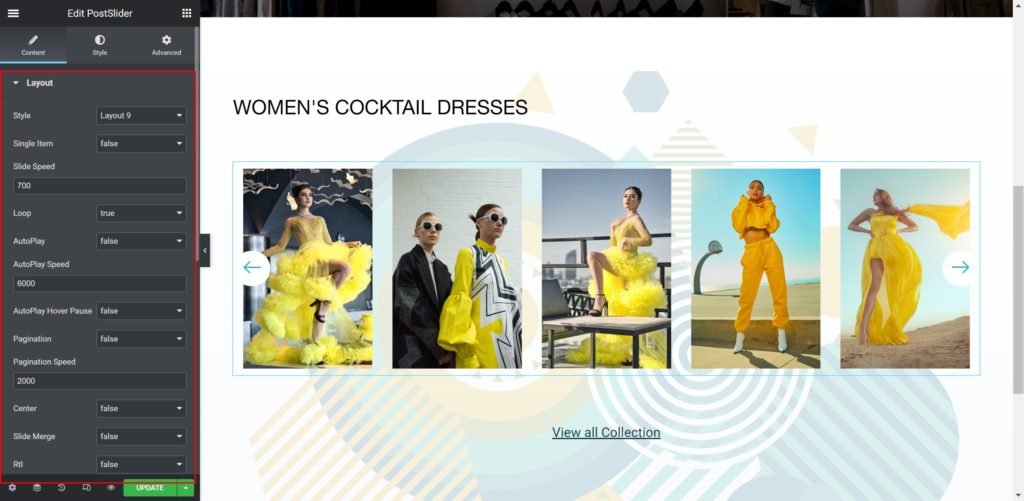
Slider Options
- Layout: Choose from Image Inline, Image Stacked, Image Above, Image Left, Image Right.
- Slide Speed: Set the time between slide movement, in milliseconds.
- Loop: Have the slides rotate in an infinite loop and without stopping.
- AutoPlay: Slide to YES to have the carousel slide automatically.
- AutoPlay Speed: Set the speed at which the carousel will slide, in milliseconds.
- AutoPlay Hover Pause: Make the slide pause when the mouse hovers over it.
- Pagination: Select the carousel pagination style, either None, Dots, Fraction, or Progress.
- Pagination Speed: Set the time between slide movement, in milliseconds.
- Center: Slides Positions.
- Slide Merge: Merge 2 slides together in one slide.
- Rtl: Choose a direction for the slider as left or right.
- Columns Per Page / Desktop: Select the number of slides to show at one time, from 1 to 6.
- Columns Per Page / Desktop Small: Select the number of slides to show at one time, from 1 to 6.
- Columns Per Page / Tablet: Select the number of slides to show at one time, from 1 to 6.
- Columns Per Page / Mobile: Select the number of slides to show at one time, from 1 to 6.
- Slide Navigation: Choose to display arrows, dots, both or none.
- Prev Button Text: Enter the Prev button custom text.
- Next Button Text: Enter the Next button custom text.
- Go To First: Select how many slides to scroll per swipe.
- Go To First Speed: Set the time here.
List Items
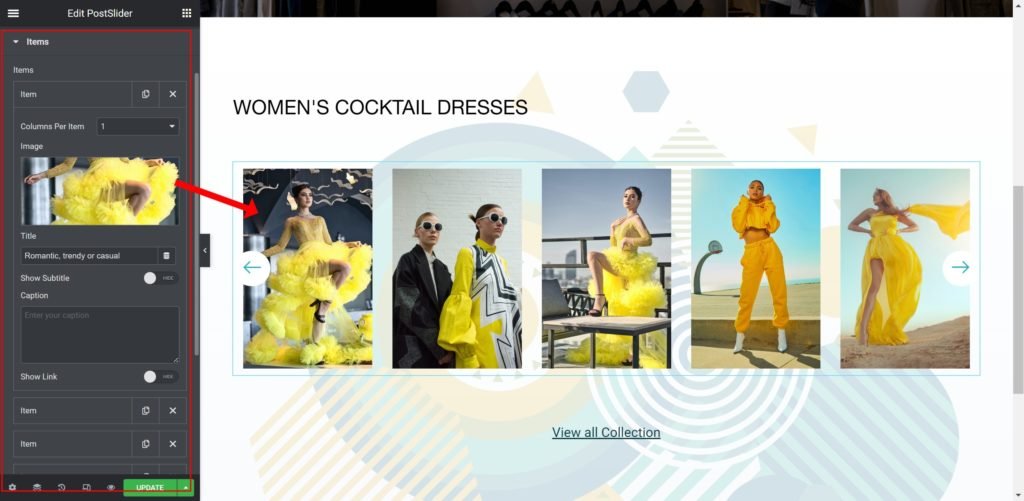
Shows a list of all the items in the slide. You can drag and drop them to change their order. Click on the Add Item button to add another item to the list.
Shows the list of slides. You can drag and drop them to change their position, duplicate, delete or add a slide. When you click on a single slide, its options open up. Each slide has Background, Content and Style settings.
- Image: Upload or Choose an image from the media library.
- Title: Enter the slide’s title.
- Show Subtitle: Choose whether to show or hide the subtitle. The subtitle will display while hovering over the images.
- Subtitle: Insert the subtitle for the slide.
- Caption: Insert the caption for the slide.
- Show Link: Choose whether to show or hide the link.
- Button Text: Set the text for the button.
- Link to: Add a URL the slide or button will link to.
Style

Box:
- Border Widget: Set the thickness of the border around each slide.
- Border Radius: Set the border radius for the images to control corner roundness.
- Padding: Set the inner spacing between the edge of the content and the edge of the slide.
- Margin: Set the outer spacing between the edge of the content and the edge of the slide.
- Item Height: Set the height of the widget.
- Alignment: Align the content to the right, left or center.
- Background Color: Set the background color of the overlay when you hover over the image.
- Border color: Choose the border color.
- Box-shadow: Give the search bar a box shadow.
Title:

- Title HTML Tag: Wrap the title with a tag, either H1…H6, span, div or paragraph.
- Typography: Customize the typography of the Title.
- Color: Set the post’s Title color. The title appears within the overlay when you hover over the image.
- Margin: Set the outer spacing between the edge of the Title and the edge of the item slide.
Subtitle:
- Subtitle HTML Tag: Wrap the subtitle with a tag, either H1…H6, span, div or paragraph.
- Subtitle Typography: Customize the typography of the Subtitle.
- Color: Set the post’s Subtitle color.
- Margin: Set the outer spacing between the edge of the Subtitle and the edge of the item slide.
Caption:
- Caption Typography: Customize the typography of the Title.
- Color: Set the post’s Caption color.
- Margin: Set the outer spacing between the edge of the caption and the edge of the item slide.
- Padding: Set the inner spacing between the edge of the caption and the edge of the item slide.
Hover Background:
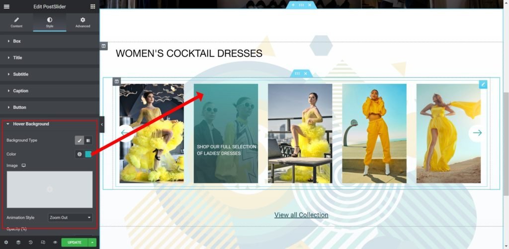
- Background Type: Choose whether to display the background as color or image.
- Color: Set the background color for the slide.
- Image: Choose an image from the media library.
If an image is chosen as a slide background, additional options appear:
Size: Choose whether to display the background as cover or auto. The auto image is for situations where you have the exact sizes needed, and also where you would want the entire image to appear in the slider. The cover size is for more abstract and atmospheric images, where the showing of the entire image is less important. - Animation Style: Set the animation effect of the content’s display when the slide is shown: None, Down, Up, Right, Left, or Zoom.
- Opacity (%): Set the overlay effect transparency.
Navigation:
- Color: Set the color for the controls.
- Background Color: Set the background color for the controls.
- Margin: Set the outer spacing between the edge of the button and the edge of the slider.
- Padding: Set the inner spacing between the edge of the button and the edge of the slider.
- Border Radius: Set the border radius for the button to control corner roundness.
- Opacity (%): Set the button transparency.
- Navigation Typography: Customize the typography of the button text.
- Left Icon: Choose from a list of Font Awesome icons.
- Right Icon: Choose from a list of Font Awesome icons.
Pagination Control:
- Margin: Set the outer spacing between the edge of the pagination dots.
- Color: Set the color for the pagination dots.