 FAQs
FAQsLayout
Shows a list of all the items in the slide. You can drag and drop them to change their order. Click on the Add Item button to add another item to the list.
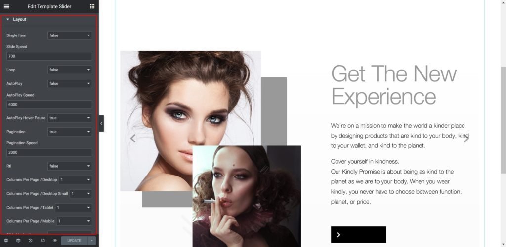
Slider Options
- Slide Speed: Set the time between slide movement, in milliseconds.
- Loop: Have the slides rotate in an infinite loop and without stopping.
- AutoPlay: Slide to YES to have the carousel slide automatically.
- AutoPlay Speed: Set the speed at which the carousel will slide, in milliseconds.
- AutoPlay Hover Pause: Make the slide pause when the mouse hovers over it.
- Pagination: Select the carousel pagination style, either None, Dots, Fraction, or Progress.
- Pagination Speed: Set the time between slide movement, in milliseconds.
- Rtl: Choose a direction for the slider as left or right.
- Columns Per Page / Desktop: Select the number of slides to show at one time, from 1 to 6.
- Columns Per Page / Desktop Small: Select the number of slides to show at one time, from 1 to 6.
- Columns Per Page / Tablet: Select the number of slides to show at one time, from 1 to 6.
- Columns Per Page / Mobile: Select the number of slides to show at one time, from 1 to 6.
List Items

Shows a list of all the items in the slide. You can drag and drop them to change their order. Click on the Add Item button to add another item to the list.
Content Type:
– HTML Editor: Insert any custom html content for each slide.
– Elementor Template: Choose from the Elementor saved templates if available.
Choose Template: List of all Elementor saved templates if available.
Style
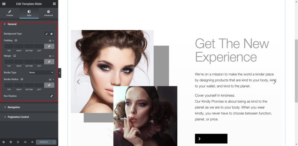
Box:
- Background
Color: Set the background color for the slide.
Image: Choose an image from the media library.
If an image is chosen as a slide background, additional options appear:
Size: Choose whether to display the background as cover or auto. The auto image is for situations where you have the exact sizes needed, and also where you would want the entire image to appear in the slider. The cover size is for more abstract and atmospheric images, where the showing of the entire image is less important. - Padding: Set the inner spacing between the edge of the content and the edge of the slide.
- Margin: Set the outer spacing between the edge of the content and the edge of the slide.
- Border Type: Select the border type, from none, solid, double, dotted, dashed, or grooved.
- Border Radius: Set the border radius for the images to control corner roundness.
- Box-shadow: Give the search bar a box shadow.
Navigation:
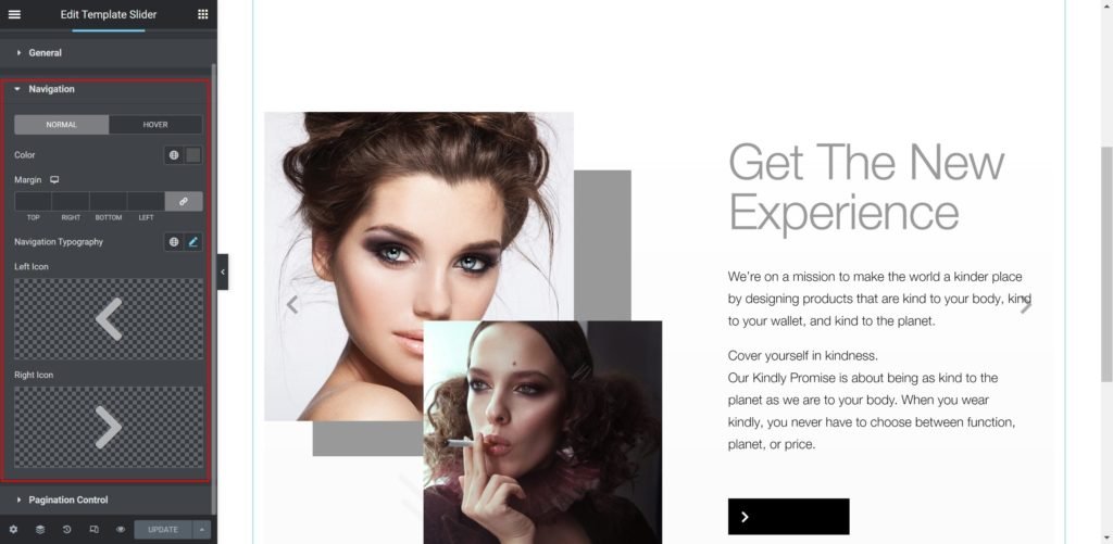
- Color: Set the color for the controls.
- Margin: Set the outer spacing between the edge of the button and the edge of the slider.
- Navigation Typography: Customize the typography of the button text.
- Left Icon: Choose from a list of Font Awesome icons.
- Right Icon: Choose from a list of Font Awesome icons.
Pagination Control:
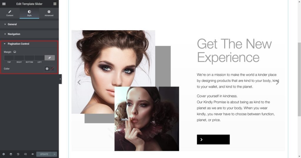
- Margin: Set the outer spacing between the edge of the pagination dots.
- Color: Set the color for the pagination dots.